Colour trends don’t keep a calendar. The rich autumn colours making waves up north can look incredible here, so long as you tune the weight and materials for spring light. Because let’s face it, we love our pumpkin-spiced lattes in Spring, but we want to say goodbye to the moody looks of Winter and Autumn.
The four shades leading autumn mood boards this year are earthy green, deep mauve, marigold, and rust, and with the right twist, can work really well for our Spring.
ALSO SEE: The best art for your interior design style: A guide to curating the perfect wall
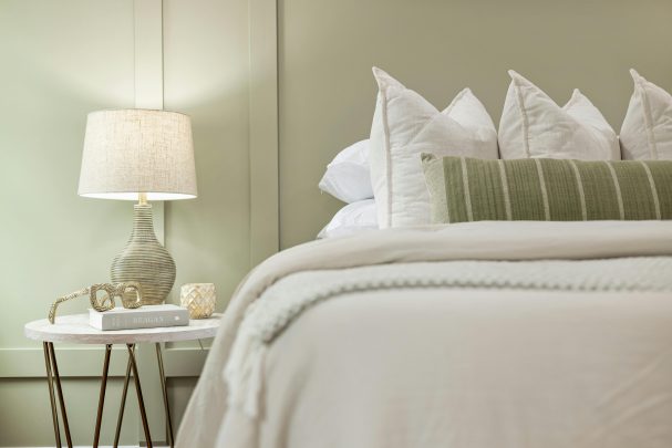
Earthy green becomes garden‑fresh
Pexels
Moss and olive feel wonderfully grounding. For spring, steer them away from dark woods and wool throws and pair with chalky whites, pale oaks and glass. Paint a bookshelf or sideboard in a soft olive, then style with fresh foliage, linen‑covered books and pale stone. In bedrooms, a dill‑green headboard against white walls delivers colour without closing the room in.
Deep mauve, but sunlit
The ‘eggplant’ family reads luxurious in autumn; in spring, it shines as an accent rather than a room wrap. Try mauve on velvet cushions swapped for lighter cotton‑mix covers, or a single painted piece—bathroom vanity, bedside, or pantry door—balanced with polished nickel and milky tiles. Keep nearby neutrals warm (bone, oat, putty) so mauve feels floral, not wintry.
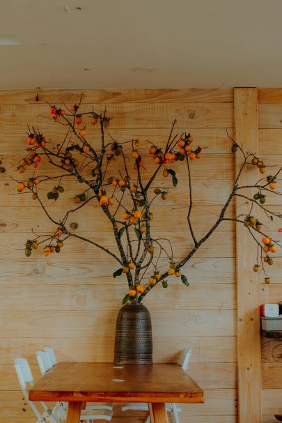
Marigold goes zesty
Marigold is mustard’s livelier cousin. Instead of enveloping walls, introduce it through table linen, lampshades and artworks with plenty of white space. In kitchens, a marigold Roman blind over a crisp white splashback wakes the room without heating it up. Outdoors, scatter marigold cushions on teak or woven resin for a sun‑lit nod that won’t dominate.
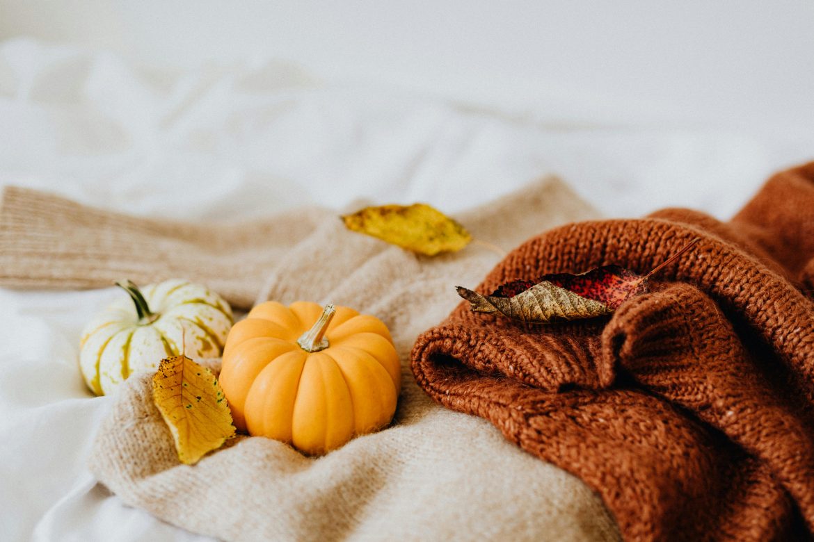
Rust, refined
Rust sits between terracotta and burnt orange—cosy by nature. Lighten it for spring by using matte ceramics, linen and raffia rather than velvet or leather. A rust rug with cream walls and pale oak floors looks earthy yet bright. In bathrooms, rust‑striped towels and a clay‑glaze vase bring warmth without the weight of a full colour change.
How to keep it spring‑lean
- Materials: trade wool and boucle for cotton‑linen, voile and rattan.
- Prints: swap heavy plaids for ditsy florals, botanical line drawings and gingham.
- Balance: for every rich tone, add two pales—white, ivory, sand—to keep spaces luminous.
- Greenery: fresh stems (euphorbia, herbs, fern fronds) make deeper colours feel alive.
The result? A home that nods to global colour trends while still feeling breezy, bright and unmistakably in season.
ALSO SEE:
Bringing farmhouse aesthetic into your home – without it looking tacky
Featured Image: Pexels