From gentle greens to calm blues, paint colours should create a sense a serenity in your home. These are the colours that interior designers agree will encourage a peaceful and relaxing environment.
ALSO SEE: This season’s hottest autumn colours—reimagined for a fresh spring home
Your home should be your sanctuary, a place where you can soothe your nervous system. Furniture and lighting play a role in achieving this, but designers agree that paint colour has the most immediate emotional effect. The right shades alleviate visual noise, cue a sense of safety and make your space feel like a retreat.
Here are colours interior designers recommend for a serene home.
Soft, rather than stark whites
Not all whites are the same. For instance, a crisp white can feel clinical and cold, while a warm white with ivory undertones feels gentle and inviting. These whites are softer and reflect light without harshness, so rooms feel more open and comforting. They work in bedrooms and living rooms where rest is the priority.
Gentle greens inspired by nature
Olive, soft sage and muted eucalyptus tones are among designers’ top choices for calm interiors. Green is associated with nature, and helps signal restoration and safety. These shades, especially if they’re muted, work in bedrooms, bathrooms and reading corners. You want your space to feel grounded and peaceful.
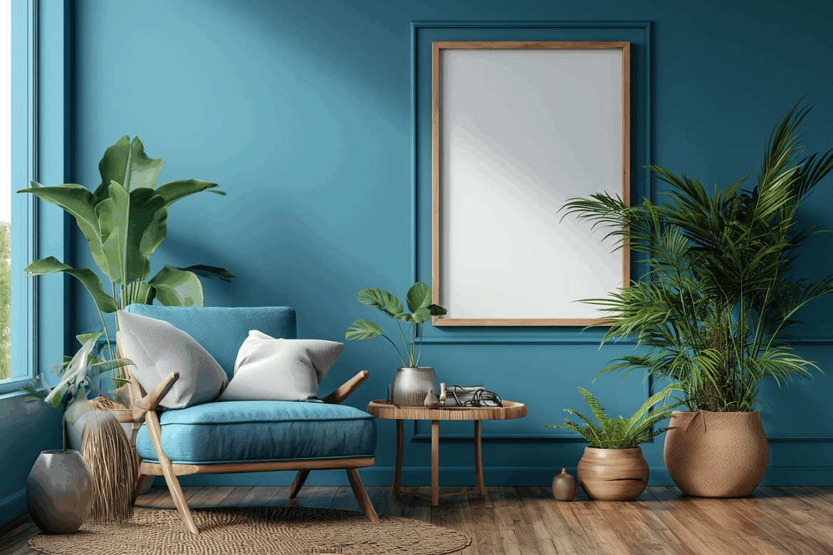
Muted blues to soothe the mind
Blue is linked to calmness but you have to opt for muted tones. Grey blue, duty blue or powder blue creates serenity without being overly cold. They remind one of the sky and water, elements that are associated with stillness. These colours are very effective in bedrooms and encourage rest.
Warm neutrals for emotional comfort
Taupe, greige and beige give a subtle warmth but don’t overwhelm the senses. They create a cocooning effect, making the space feel secure and stable. Designers often use warm neutrals in open-plans homes that create visual continuity and reduce mental clutter.
Muted lavender and soft blush for gentle warmth
Bold pinks and purples can feel energy and fun, but dusty blush and pale lavender offer a sense of sophistication. These tones add warmth and personality but with warmth. They’re perfect for bedrooms or personal spaces where emotional comfort his essential.
Calm comes from softness, not boldness
Ultimately, calming colours have one thing in common: softness. Muted and warm shades that’s slightly greyed-out feel more restful than bright, saturated hues. Choosing gentler tones can transform your home into a space that’s all about relaxation, emotional ease and clarity.
ALSO SEE: