White paint looks simple on a sample card and bewildering once it is on the walls. The crisp, fresh colour you were certain about in the shop has turned buttery and warm, or taken on a faintly pink cast, or somehow become dingier than the wall it replaced. You have not made an error of judgement. You have run into one of the more technically interesting challenges in interior decorating.
Understanding why white paint behaves unpredictably is the first step to choosing a shade that actually works in your space. The explanation comes down to two things: undertones and light.
What undertones actually are
No white paint is purely white. Every shade contains a small amount of another pigment that shifts it subtly in one direction. These undertones are what give white paint its character and, more importantly, its behaviour in a real room under real light.
The most common undertones in white paint are yellow, pink, red, grey, green and blue. In isolation on a sample card in a paint shop, the differences between shades can be almost impossible to detect. But once a white with yellow undertones meets warm afternoon light, the yellow amplifies. Once a white with grey undertones meets a north-facing room with cool, flat light, it can feel cold and slightly depressing. The undertone is always there: what changes is how visible and dominant it becomes depending on the light conditions in your specific space.
How light determines what you actually see
The orientation of a room is the single most important factor in how white paint behaves, and it is worth understanding clearly before buying a single test pot.
In South Africa, north-facing rooms receive the most direct, warm sunlight throughout the day. This light has a golden quality that amplifies warm undertones: a white with yellow, cream or ochre undertones will look noticeably warmer and more yellow in a north-facing room, particularly in the afternoon. In these spaces, whites with cool undertones, including grey, blue or violet, are the better choice because these act as a counterbalance to the warmth of the light, keeping the room feeling crisp rather than creamy.
South-facing rooms receive cooler, more indirect light. Here, cool-toned whites can feel cold, flat or even slightly gloomy. Whites with warm undertones, including subtle hints of pink, peach or soft red, counteract the blue quality of the light and produce a more balanced, welcoming result. The warmth of the undertone compensates for what the light does not supply naturally.
East-facing rooms get bright morning sun that is relatively cool and clear, which suits most whites well. West-facing rooms receive the warmest, most orange-tinged light of the day in the late afternoon and evening, which intensifies any warm undertones significantly. A white that looked perfectly neutral in the morning will pull noticeably yellow or amber in a west-facing room by late afternoon.
The effect of artificial lighting
Natural light is only part of the story. Artificial lighting has its own colour temperature that interacts with paint just as daylight does, and in rooms that rely heavily on artificial light in the evenings, this interaction matters considerably.
Warm-toned bulbs in the 2 700 Kelvin range, which most homes default to, emit a yellow-orange light that intensifies warm undertones in white paint. A white that looks perfectly neutral by day can become distinctly yellow or cream under warm artificial lighting at night. Switching to bulbs in the 4 000 to 5 000 Kelvin range, described on packaging as daylight or cool white, produces a neutral to slightly blue-white light that reduces this effect and allows cooler white shades to read more accurately after dark.
How to see undertones clearly before you commit
Paint sample cards in a shop are notoriously misleading. They are viewed in artificial retail lighting, surrounded by dozens of other colours, and are far too small to give a meaningful impression of how the shade will behave on four walls.
The simplest way to read undertones on a sample card is to hold it next to a sheet of pure white printer paper. The contrast makes the undertone immediately visible: a white that looks neutral on its own will reveal its yellow, pink or grey lean clearly against a truly neutral reference point. This one habit will save considerable time and money.
Once you have narrowed to two or three candidates, buy sample pots and paint large swatches, at least A3 in size, directly onto the walls in different parts of the room. Observe them at different times of day and under the artificial lighting you use most in the evenings. A swatch that looks great at midday but goes yellow at 7pm is not the right white for that room.
The other elements in the room matter too
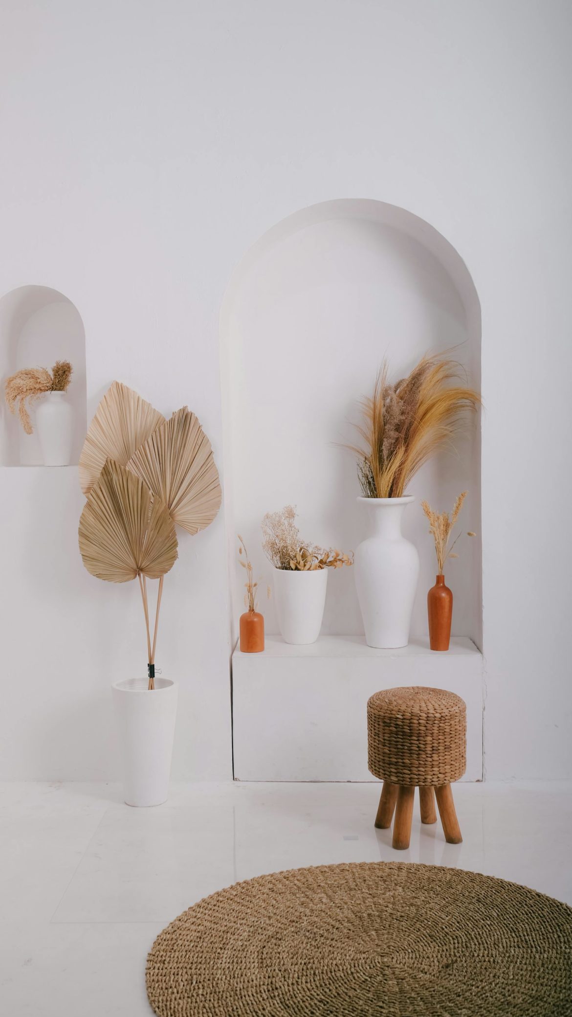
White paint does not exist in a vacuum. The flooring, furniture, textiles and artwork in a room all reflect colour back onto the walls, and this reflected light influences how the white reads. Warm timber floors, natural linen, rattan furniture and terracotta accessories all add warmth to the room that white paint will absorb. In a room with predominantly warm materials, a cooler white will feel more balanced than a warm one.
Conversely, in a room with a lot of grey, stone, steel or dark furniture, a warm white may read better than a cool one because it prevents the overall scheme from feeling too cold. The white on the walls does not operate independently: it is in constant conversation with everything around it, and the most successful choices account for the whole room rather than just the paint.
ALSO SEE:
Featured Image: Pexels