
Autumn interiors are less about dramatic overhauls and more about subtle, comforting transitions – often led by colour. This season, two palettes stand out, warm neutrals and rich autumn hues. Both bring depth and coziness, but the right choice depends on your space, your lifestyle, and the mood you want to create.
So, which one truly suits your home?
The case for warm neutrals: Soft, timeless, and effortlessly calm
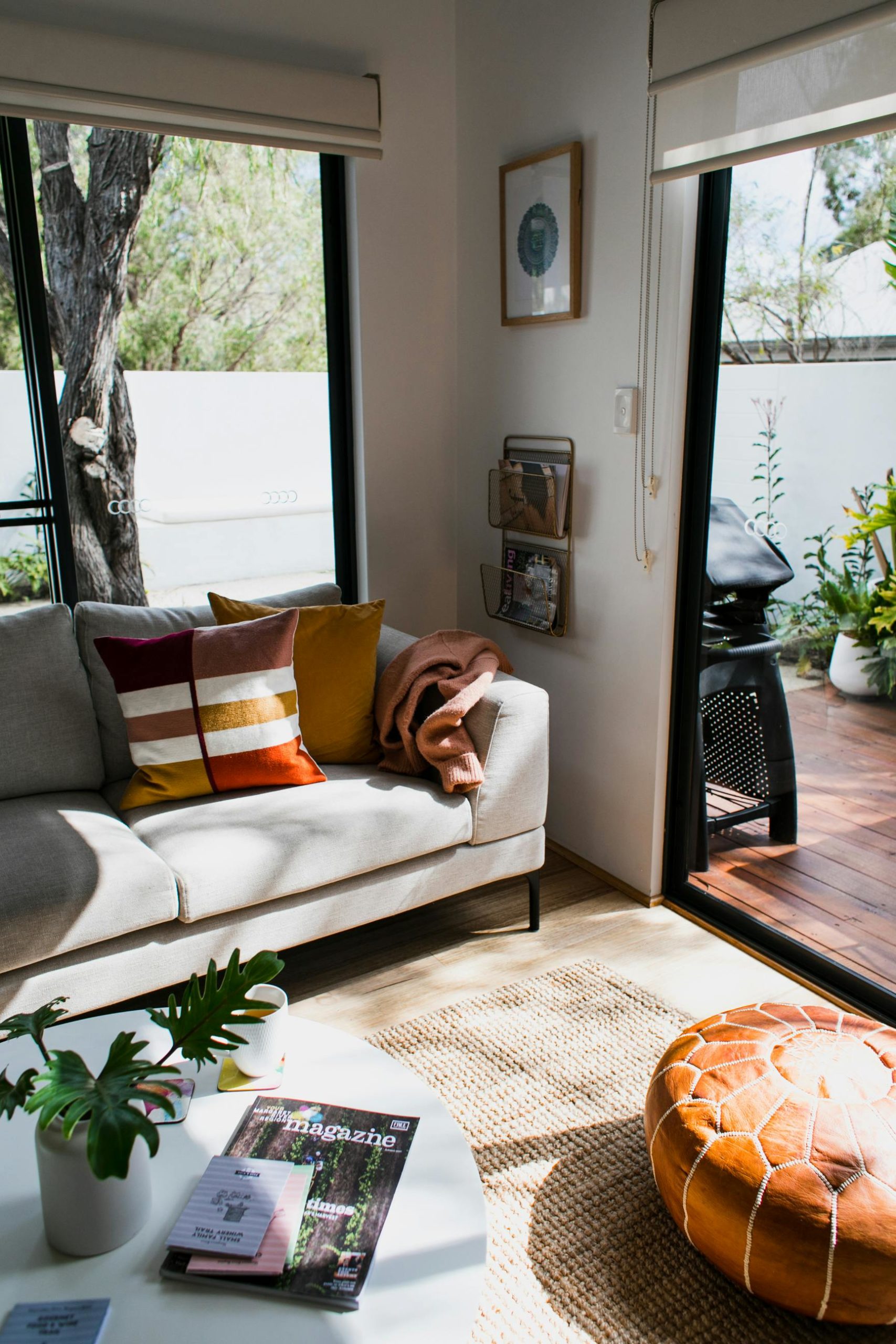
Warm neutrals are the understated heroes of interior design. Think creamy ivories, soft taupes, caramel tones, and warm greys – shades that feel grounded without overpowering a space.
The warm neutral colour palette creates a sense of calm and simplicity, making them perfect for anyone craving a more serene, clutter-free environment. If your aesthetic leans minimal, feminine, or “soft life,” warm neutrals offer a beautiful foundation.
They reflect natural light, making smaller spaces feel bigger and brighter, act as a versatile backdrop for seasonal styling and pair seamlessly with textures like linen, boucle, wool, and wood.
This palette is best for small apartments or rooms with limited natural light, open-plan spaces where cohesion is key or anyone who prefers a clean, editorial look.
Layer different textures rather than colours. A beige sofa, a chunky knit throw, a woven rug, and wooden accents can create depth without needing bold colour. Add subtle contrast with black, brass, or deep brown finishes for a more elevated feel.
The case for rich autumn hues: Bold, moody, and inviting
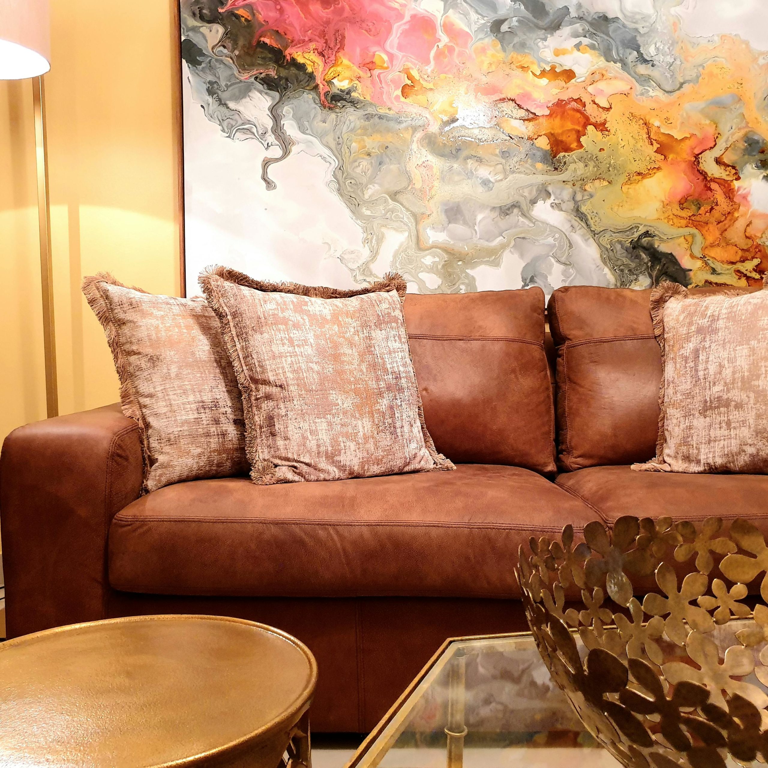
If warm neutrals whisper, rich autumn hues speak in a low, confident tone. Think deep terracotta, burnt orange, olive green, mustard, burgundy, and chocolate brown—colours that mirror the changing landscape outside.
They instantly add warmth and personality to a space. These tones feel cocooning and intimate, making them ideal for creating that “stay in, light a candle, and unwind” atmosphere.
They add visual interest and depth, even in simple spaces, work beautifully in the evening when lighting is softer and bring a sense of seasonal drama without needing excessive décor.
Rich hues are best suited in larger rooms that can handle deeper tones, living rooms, bedrooms, and dining spaces where mood matters or anyone who loves a more expressive, layered interior.
Start small if you’re hesitant – cushions, throws, or curtains in autumn hues can transform a neutral base. For a bolder approach, consider an accent wall or upholstered furniture in a rich tone. Balance is key, pair deeper colours with lighter elements to avoid the space feeling too heavy.
How to choose: A quick guide
When deciding between warm neutrals and rich autumn hues, ask yourself:
How much natural light does my space get?
Less light leans toward warm neutrals; more light can handle deeper hues.
What mood do I want to create?
Calm and airy will lead to warm neutrals, cozy and cocooning you will want rich autumn hues.
Do I like to change my décor often?
Warm neutrals offer more flexibility for seasonal updates.
Am I drawn to subtlety or statement?
Neutrals are timeless; autumn hues are expressive.
The best of both worlds
The truth is, you don’t have to choose just one.
Some of the most beautiful interiors blend both palettes using warm neutrals as a base and layering in rich autumn tones through accessories and accents. This approach gives you the grounding effect of neutrals with the seasonal richness of deeper hues.
Think a soft beige sofa styled with rust-toned cushions, or a neutral bedroom warmed up with olive bedding and a deep brown throw.
Your home should reflect not just the season, but your energy within it. If you’re craving stillness, simplicity, and a sense of reset, warm neutrals will feel like a breath of fresh air. If you’re leaning into comfort, depth, and a more indulgent atmosphere, rich autumn hues will wrap your space in warmth.
Either way, autumn is less about perfection and more about how your space makes you feel when you walk through the door.
ALSO SEE:
Featured Image: Pexels