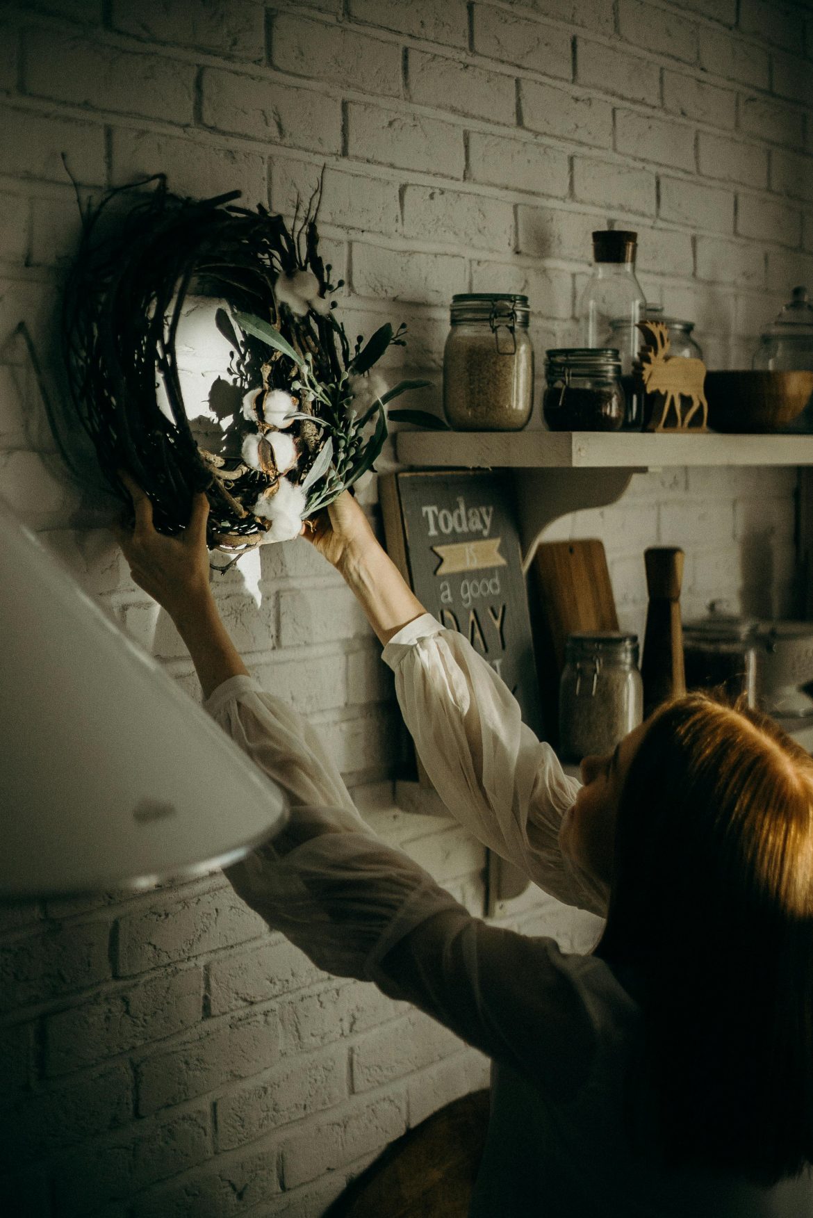
A well-designed home does not shout. It feels settled, purposeful and lived in, the kind of space where you walk through the door and instantly know where to sit, where to look and how to breathe out. That ease is not an accident. It is the quiet result of a few guiding principles that help you make confident choices, edit the noise and layer personality without tipping into chaos. Learn the rules, then bend them with intent.
Balance
Balance is the sense of visual steadiness that stops a room from feeling lopsided. Symmetry is the classic route: a pair of sofas facing across a rug, twin lamps flanking a mirror, matching bedside tables on either side of the headboard. It reads calm and considered, which is why it works so well in living rooms and bedrooms. Asymmetry is looser but just as effective. You might place one substantial floor lamp opposite a cluster of slimmer pieces, or counter a bold artwork with shelves styled in lighter tones. The weights differ, but the overall feeling does not. Radial balance is rarer but striking; think a circular table with chairs radiating from a pendant above, or a curved banquette wrapped around a round table. Whichever route you choose, aim for equilibrium, then puncture the perfection with a note of surprise so the space feels human rather than staged.
Rhythm
Rhythm is what keeps the eye moving. Repetition of a colour, a shape or a material creates a gentle beat that ties zones together. Ceiling beams echoed by slatted doors, stripe motifs picked up in cushions and curtains, a run of identical pendants over an island, these repeated cues knit a scheme without shouting. Progression is rhythm too. Art that steps up a staircase, tiles that graduate from deep to pale, vases that rise in height across a console, all of it gives the room pace. The aim is predictability in the best sense, a pattern your brain can follow so the space feels cohesive and easy to read.
Emphasis
Every room needs a moment that leads. If architecture gives you one, use it. A fireplace, a picture window, a generous archway or a full-height bookcase will naturally claim attention. If the bones are quiet, create emphasis with scale or contrast. A large pendant over a dining table, a saturated wall colour with paler trim, a statement headboard or a single oversized artwork can anchor the composition. Once you have a focal point, let the other elements defer to it. Side tables, textiles and accessories should support rather than compete, so the room tells one clear story instead of five at once.
Proportion and scale
Proportion is the relationship between the sizes of things. Scale is their absolute size. Get these right and a room feels grounded. Most people undersize, especially in smaller rooms, which makes everything look mean and floaty. Try a bigger rug that slides under front legs at least, a taller headboard to lift a low ceiling, a larger coffee table to bring a seating group together, a piece of art that truly fits the wall rather than perches on it. Mix scales deliberately, too. One or two exaggerated items, a generous lamp or a chunky weave on a throw, set against finer details, will add bite. Keep sightlines and door swings in mind, then edit out duplicates. Ten medium objects will clutter a space more than three large ones and two small.
Harmony
Harmony is the red thread. It is not about matching everything. It is about establishing a shared language and repeating it with variation. Choose a restrained palette and let it flow from room to room, adjusting depth for mood and light. Repeat materials in more than one place so finishes feel intentional; a hint of brass on a wall light, echoed by a frame and a handle, is enough. Unify envelopes when it helps. Painting walls and ceilings in the same hue can make awkward rooms feel deliberate and cocooned. Most importantly, allow for quiet. If every item is a main character, the space becomes exhausting. Give standout pieces space to breathe and let supporting acts do their job.
Putting it into practice
Start with a plan rather than a purchase. Map how you live in the room, decide your focal point, sketch a furniture layout that respects circulation, then test the balance by eye. Sample colours on large swatches and watch them from morning to evening. Choose a rug that anchors the group, add the right-sized lighting for task and mood, and bring in storage early so clutter has somewhere to go. Layer textiles and art once the bones are right. The more decisions you make in relation to the principles above, the fewer second guesses you will have later.
Design is part science, part instinct. Learn the fundamentals, so your instinct has something solid to lean on. When balance, rhythm, emphasis, proportion and scale, and harmony work together, the result is a home that looks considered, functions smoothly, and, crucially, feels like you.
ALSO SEE:
How to incorporate coat racks into your home design without it looking tacky or cluttered
Featured Image: Pexels

